The COVID-19 pandemic keeps pushing us to master new digital skills. Online meetings have become the new normal, with the demand for web conferencing software observing a striking 511% increase. However, connecting to the right platform to deliver your presentation is not the only challenge you might face. You need to take care of the tech side of your performance (like having a properly functioning mic and cam), get your working space ready for going live, and, of course, create a presentation itself. Let’s address the latter challenge since we are not all born professional designers. 
Visuals over Text
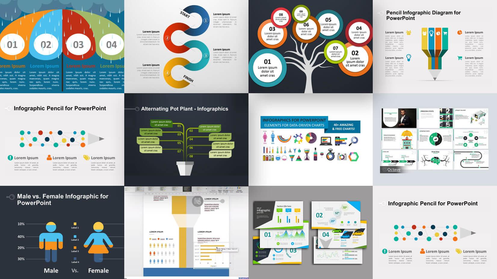
Our brains love visual content, and almost every speaker has at least heard about this. Still, we observe too many presentations that have slides stuffed with words instead of illustrating the ideas with images. Why? Because selecting a suitable picture or making a descriptive diagram takes more time and skill than typing texts. But your fear of working with imagery is a rather poor excuse since nowadays, you can find an online design, add animated effects to pictures, use visually impactful PowerPoint templates, photos, and backgrounds to make constructing visuals a piece of cake. So, replace texts with images whenever it’s possible to lend a more digestible presentation.
Duplication Is under a Bun
We’ve said “replace”, not duplicate. It’s a common mistake when speakers insert text descriptions of pictures into slides or, what is even more frequent, voice the same ideas that are shown in them. What’s the point? Your audience doesn’t need you to spoon-feed it with the information they already got. If your presentation doesn’t imply your acting as a speaker, make sure your text and images round each other out to keep the story flowing. If you are going to address the audience, illustrate with slides the ideas that cannot be presented properly in the verbal form.
Keep It Simple

The most interesting presentations deliver new information to an audience. The business audience responds to statistics, trend analysis, and performance dynamics. By showing tables and charts, you can significantly increase the effectiveness of your presentation. At the same time, it is important to avoid overloading your slides with a large amount of data and complex visualization. A diagram can be helpful in conveying an important idea, but only if it is easy to understand and takes no more than a couple of seconds to capture. If speaking to a non-expert audience, it’s better to employ infographics.
Get them Hooked from the Very Start
Do you know that our average attention span shrank to eight seconds? This means that if you don’t find a way to start your presentation with a bang, your audience is likely to slip away. Here are a couple of ideas on that:
- ask an unexpected question
- tell a timely joke
- bring out striking statistics
- use a relevant quotation
- show a captivating picture
You can come up with something even more creative, but don’t forget to leave something catchy for last as well.
Slide-Wise Approach
Since we have already learned that you need to really struggle for your audience’s attention, there is no room for long talks. Your aim is to keep them focused for 10-20 minutes at the best, and it limits the number of your slides to 5-10 (provided that it takes a person 2-3 minutes to grasp one slide). This leads us to the understanding of how carefully we need to pick content for online presentations. And as we know that storytelling works best to keep an audience engaged, you should cherry-pick slides to provide a seamless narration.
Clear Font

The good part about online meetings is that you don’t have to bother about the visibility of your slides to those sitting in a back row. However, you do need to bother about decipherable text displayed on the screens. A fancy font is not the best choice, as well as multiple fonts embraced within one presentation. Choose simple styles and keep them consistent throughout your slides, i.e. emphasize ideas or highlight subheadings with one font only. Using caps lock is also frowned upon, as your audience doesn’t want you shouting instead of communicating your thoughts and developing a line of argument orderly.
Sticking to Corporate Identity
By participating in a web conference, speakers market their personal brands and/or the company they represent. These days, a presentation is an effective tool for building and improving brand recognition, which is implemented through fonts, colors, logos, and other corporate identity elements. Unfortunately, plenty of speakers fail to take hold of this marketing advantage. Your presentation should include visuals that distinguish you and your company from a gazillion of other speakers and help you stay memorable.
Final Note
It’s not so tricky to create a presentation for an online meeting as to get the most out of it. By following our tips, you will be able to get your audience interested and keep it engaged throughout your show. Isn’t that what we expect from professionally designed presentations?
Follow Technoroll for more!


