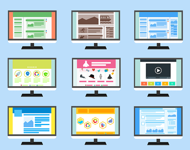
Humans are visual creatures, which is both a challenge and an opportunity for web designers. While you can instantly engage users through smart choices of font, color, and graphics, design elements that look outdated can immediately turn potential customers off your business.
As is the case with all types of design, web design is constantly evolving. Ultimately, you want to be standing out from your competitors for the right reasons — not the fact that your website doesn’t look like it’s been touched since 2000.
With that in mind, here are 10 ideas recommended by a top web design company in Melbourne that will ensure your website converts positive attention into actual sales.
Branding
When you think of a well-known company — say Google, for example — the first thing that pops into your mind is probably the distinctive blue, red, yellow, and green colors that make up their logo. We all know a lot of other things about Google, including the types of services they offer and what tech products they develop. But the fact that they have such a distinctive logo and well-known color scheme — which they have adapted for use across all their assets — certainly plays a role in making them one of the most easily recognizable companies on the planet.
Emphasize Your Company Story
Truth be told, many of the products and services you offer are likely to be pretty similar to your competitors. Standing out can therefore seem like a pretty big challenge.
However, consumers look for a lot more when deciding on what company to shop or work with. While online shopping has become the norm, we still want to be sure that we’re doing business with a team that is reputable, trustworthy, and made up of real people.
As such, including a personalized ‘about us’ section is one of the best ways that you can convey what makes you different from your competitors. The section doesn’t have to be lengthy but from a design perspective, it should be easily accessible.
Put yourself in the shoes of a potential customer and ask what you would want to know about a company before handing your money over. And of course, as is the case with any type of content, grammar, spelling, and punctuation are extremely important and should not be sacrificed for stylistic purposes.
Use Video (wisely)
It’s hard to imagine a time when the internet didn’t have video. Now, it’s estimated that in 2022, the video will make up 82 percent of all consumer internet traffic. With that statistic in mind, you might be tempted to include some form of video on every single page of your site. However, from a design and development perspective, this is not necessarily the best move.
One of the biggest challenges facing designers is balancing the visual appeal of a website against its functionality. The fact is, the more video you include on your website, the longer it will take to load. Arguably more important than your design is your website speed. According to some studies, 1 in 4 visitors will abandon a website if it takes longer than four seconds to load.
The lesson is to certainly use video but use it wisely. Avoid video pop-ups, which can distract from the overall experience of a site. Instead, integrate video in a sparing manner that complements other forms of content, including photos and written word.
Avoid Stock Photos and Assets
Creating a website is not a cheap endeavor. However, there are certain areas in which you shouldn’t be looking to cut corners. Photography is one of them.
Purchasing stock photos for a couple of dollars might seem like the cheaper and more convenient option. But what you save in the short run can have a significant impact on the conversion level of your website. Research suggests that customers are pretty smart and selective. When presented with the choice of shopping with a company that uses stock images for their website vs. one that does not, visitors were 35 percent more likely to choose the latter — even though they were not aware of the actual difference between the two.
The lesson here? Good design might require an initial outlay, but you’ll quickly make that money back in customer sign-ups and sales.
Straightforward Layouts
Standing out from the crowd doesn’t always involve re-inventing the wheel. Sometimes, the best way to stamp your authority over your competitors is doing exactly as they do, only better.
Take website layout in mind. Visitors arrive at a website with a very strict idea in mind as to what page hierarchy and structure should look like. They expect that clicking on a certain link will take them to a certain page. They know that contact information can be found on the bottom header of the site. In the case of e-commerce sites, a shopping cart icon should be sitting in the top right-hand corner.
Playing around with these expectations too much can cause frustration amongst customers and may lead them to simply abandon your site before they have a chance to see how great your company is.
When it comes to website design, above all, you should understand that the process will take time. Even the best web design company in Melbourne can’t produce a state-of-the-art website overnight. However, the time you put in at the early design stages can be the difference between your site towering over your competitors or being lost in the very crowded world of the internet.
Follow Technoroll for more!


