The secrets of great web design may be known to a select few who have the right qualifications, training, and experience. But as a business owner or a website visitor, it doesn’t take much for you to tell a good design from a bad one.
While many specialists argue that design thinking is a subjective experience, and if the client likes it, what’s there to debate about.
But if you find that your website lacks visitors, or that though traffic seems to be great, the conversion rates are poor, you’re getting mean reviews on social media, visitors drop in at your website, but they’re exciting too quickly – then it’s certainly time to put the brakes on and take a good look at your website. These are definite signs of poor B2B website design.
On the other hand, why wait for a crisis to happen – why not preempt it and avoid such issues by hiring the right website designer for your B2B business?
What Is Effective Website Design?
Don’t let the word “design” fool you into thinking that it’s all about the visuals. While aesthetics do play a significant role in the appeal of a website, it’s certainly not the overriding element.
The effective, attractive, and top-performing website design must, first of all, do its job – it is your 24x7x365 marketing department. It must also:
Drive traffic:
The main aim of your website is to ensure that it can attract traffic to itself. It has to be easy to discover on the net, among the more than a billion sites on the net across the world. Meet your customers/potential customers where they’re to be found the most. Today, nearly 50% of website traffic is via mobile phones. Ensure that your design is optimized for different channels.
Engage:
Unless a website is able to make it past the 0.05 seconds it takes a person to evaluate whether it’s good or bad, it wouldn’t be able to engage and retain their interest. Good design helps to create an instant connection, offers a clear way forward for the customer journey, and gives a great UX.
Convert:
It must also be capable of guiding the visitor/customer to the next level seamlessly by supporting their next decision. This may be in the form of providing more information or go into a purchase.
Once you have these 3 aspects in place, then it’s all about working on the details.
What Kind of Website Design Does A B2B Business Need?
Induces Browsing:
An important feature for B2B websites is one that streamlines content and provides easy, simple navigation. These two features enable access to the maximum amount of content with the least amount of effort. Ensure that the content is kept updated regularly, and it is original, fresh, and reliable.
Lead creation:
With effective communication of your brand messaging, visitors are induced to complete their journey to its logical end. This means that the UX is smooth and comfortable, with a clear CTA placed at strategic points in the journey.
Scalable:
Your business is obviously poised for growth, and your website must stay in tandem. Good B2B websites are scalable, depending on the expansion of your business, new talent coming on board, incorporation of new lines of business, mergers, and acquisitions, products and service launches, etc. A simple design allows the website owners who may be non-technical people, to make simple changes that reflect the changes. Back-end editing should be convenient and easy.
Speed:
Load times are critical for business websites since attention spans have shrunk enormously. This is also important from a search engine point of view. Slow-loading websites rank lower, or may not be discovered at all in the first two or three pages. Fast loads also mean that visitors spend more time on your website.
9 Dumb Mistakes To Avoid While Hiring A Web Designer
Designer Works on Obsolete Technology:
Platforms such as Magneto are constantly upgraded, and if your designer works on an outdated version, avoid them. Ensure that the web designer you hire is experienced in working with the latest design and development tech.
Doesn’t have expertise in your sector:
A web designer who has no experience working in your niche sector of business would not be able to do full justice to good design. Ensure that you select a designer or design company with experience, knowledge, and expertise in e-commerce website development.
Quotes rock bottom prices:
Cheap isn’t always the best. If the designer seems to be quoting way below the market rate, this should raise a red flag. Low costs often mean that corners are being cut somewhere and in the long run, it means trouble. Pricing is an important factor, but it should never be the deciding one.
Isn’t familiar with SEO tech:
SEO is so ubiquitous now as to be almost invisible. But if your designer isn’t very familiar with the tech aspects of search engine optimization and how it works, it’s best to look elsewhere. Unless your website is properly optimized for SEO, your website would be lost in the melee and sink into obscurity on page 3 or 4 of search engine rankings.
Lacks expertise in responsive design:
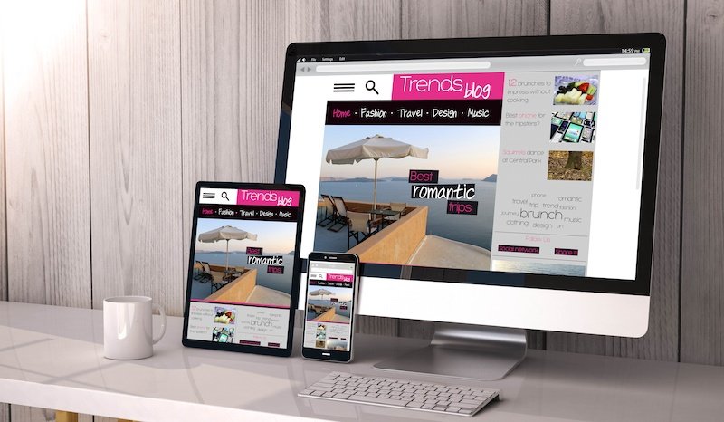
With more than 50% of internet users preferring to browse on their mobile phones, your website must be optimized for dynamic UX. The design should render well regardless of the device that’s being used to browse.
Style is too gimmicky:
Stuffing the site with unique, eyeball-grabbing design elements may win awards but it can frustrate the average customer. Studies show that simple, easy to navigate and uncluttered websites are preferred by most users. This means that the design should use simple, clear fonts, and avoid flashy and gaudy color schemes. The judicious use of uncluttered white space provides a neat and classy interlude. Check the designer’s portfolio to gauge their style and then make your hiring decisions.
Lacks clarity:
B2B websites must be professional and provide a clear and unambiguous journey. The visitor must get exactly what he/she came here for, in the minimum time. It’s annoying to search for buttons, CTAs, contact information, etc. If your web designer doesn’t seem to give importance to a simple, clear approach, this is not the one for you. If you are still not clear then go for web design company San Francisco.
The developer is stuck in time:
With technology and the web itself changing dramatically and frequently, it’s important to hire a designer who invests in new learnings. You can judge by the new courses they have attended or the latest tech that they incorporate into their work.
Not Knowing Who’s Working On Your Project:
This is a crucial aspect of interacting with a designer/design company. Ensure that you know, evaluate and meet exactly who would be working on your project from start to finish. If the design company/designer subcontracts web design company San Francisco, farms out a large chunk to freelancers, etc., ensure that you know about it and insist on meeting these people and evaluating them as well.
Follow Technoroll on social media!


